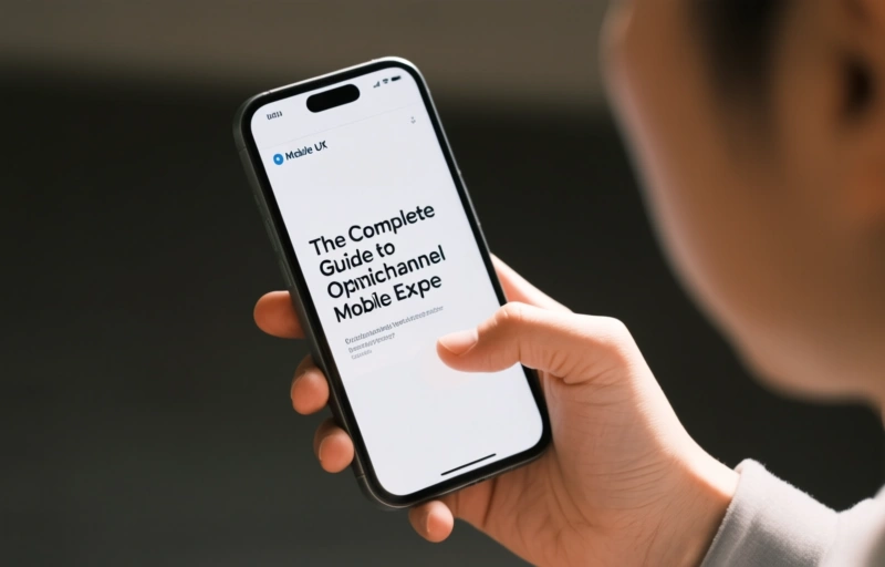
Mobile UX: The Complete Guide to Omnichannel Mobile…
David Davis ·
Listen to this article~5 min

Mobile UX goes beyond aesthetics—it's about designing for how people actually use devices on the go. With mobile traffic surpassing desktop globally, optimizing for thumb-friendly navigation and mobile-specific contexts is essential for reaching today's internet users.
Let's talk about mobile UX—or user experience for mobile devices. It's not just about making things look pretty on a small screen. It's about understanding how people actually use their phones and tablets, then designing interfaces that work with those habits, not against them.
Think about it this way: mobile users aren't just sitting at a desk. They're on the go, maybe using one hand, dealing with spotty connections, or trying to multitask. Good mobile UX considers all of that—the limitations and the unique opportunities mobile devices offer.
### The Mobile-First Reality
Here's something that might surprise you: mobile browsing has actually overtaken desktop in many parts of the world. We're talking about more than half of all web traffic coming from smartphones and tablets. In some countries, like India, mobile accounts for about 75% of internet access. That's huge when you consider it's the most populated country on the planet.
Globally, about six out of every ten internet users are connecting primarily through mobile devices. Even in France, smartphones have become the number one device for accessing the internet. People use them for everything from social media and quick searches to actual online shopping.
What does this mean for you? If your website or app isn't optimized for mobile, you're potentially missing more than half your audience. It's not an afterthought anymore—it needs to be a priority from day one.

### Understanding Mobile-Specific Behaviors
Mobile users interact with devices differently. There's something called the "thumb zone"—the area of the screen that's easiest to reach with your thumb when holding a phone with one hand. Important buttons and actions should live in this zone.
Then there's the context. People might be:
- Standing in line
- Riding public transportation
- Watching TV
- Trying to get something done quickly
Your mobile experience needs to account for these situations. Smaller screens mean less room for error. Every tap needs to count, and every second of loading time feels longer.
### The Costs of Going Mobile
Let's be real—creating a good mobile experience isn't free. There are several costs to consider:
- Development costs (that initial build)
- Store publication fees (if you're making an app)
- Hosting and backend services
- Ongoing maintenance and updates
- Marketing to get visibility
The total budget can vary wildly. A simple student or small business app might be relatively affordable, while a professional business application could require significant investment. But here's the thing: the cost of NOT having a mobile-friendly presence might be even higher in lost opportunities.
### Practical Mobile UX Strategies
So how do you actually create a good mobile experience? Start with notifications—but use them wisely. Nobody wants to be bombarded with alerts, but well-timed, relevant notifications can keep users engaged.
Then optimize the actual user experience:
- Make buttons large enough to tap easily
- Simplify forms and reduce typing
- Optimize images and content for faster loading
- Test on actual devices, not just simulators
- Consider offline functionality
Remember what one industry expert noted: "Mobile UX isn't about shrinking a desktop site—it's about rethinking the entire experience for how people actually use mobile devices."
### Looking Ahead
The trend is clear: mobile usage continues to grow. Even with temporary dips (like when more people work from home on desktops), the overall direction points toward mobile-first. Your digital touchpoints—whether websites, apps, or something in between—need to reflect this reality.
It's not just about keeping up with trends, either. A great mobile experience can actually become a competitive advantage. When users can accomplish what they need quickly and easily on their phones, they're more likely to return, recommend you to others, and become loyal customers.
The bottom line? Mobile UX matters more than ever. It's not a nice-to-have feature—it's essential for reaching and serving today's internet users. Start thinking about how your digital presence works on small screens, and you'll be better positioned for whatever comes next in our increasingly mobile world.